CBC GUOSHI MICRO FINANCE UI DESIGN
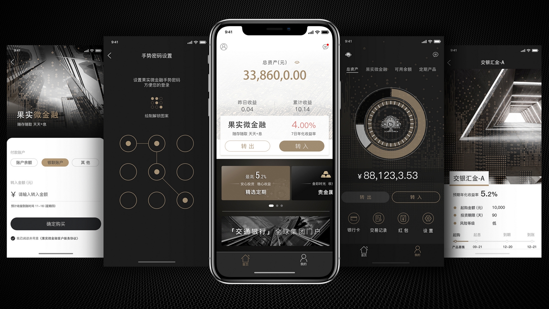
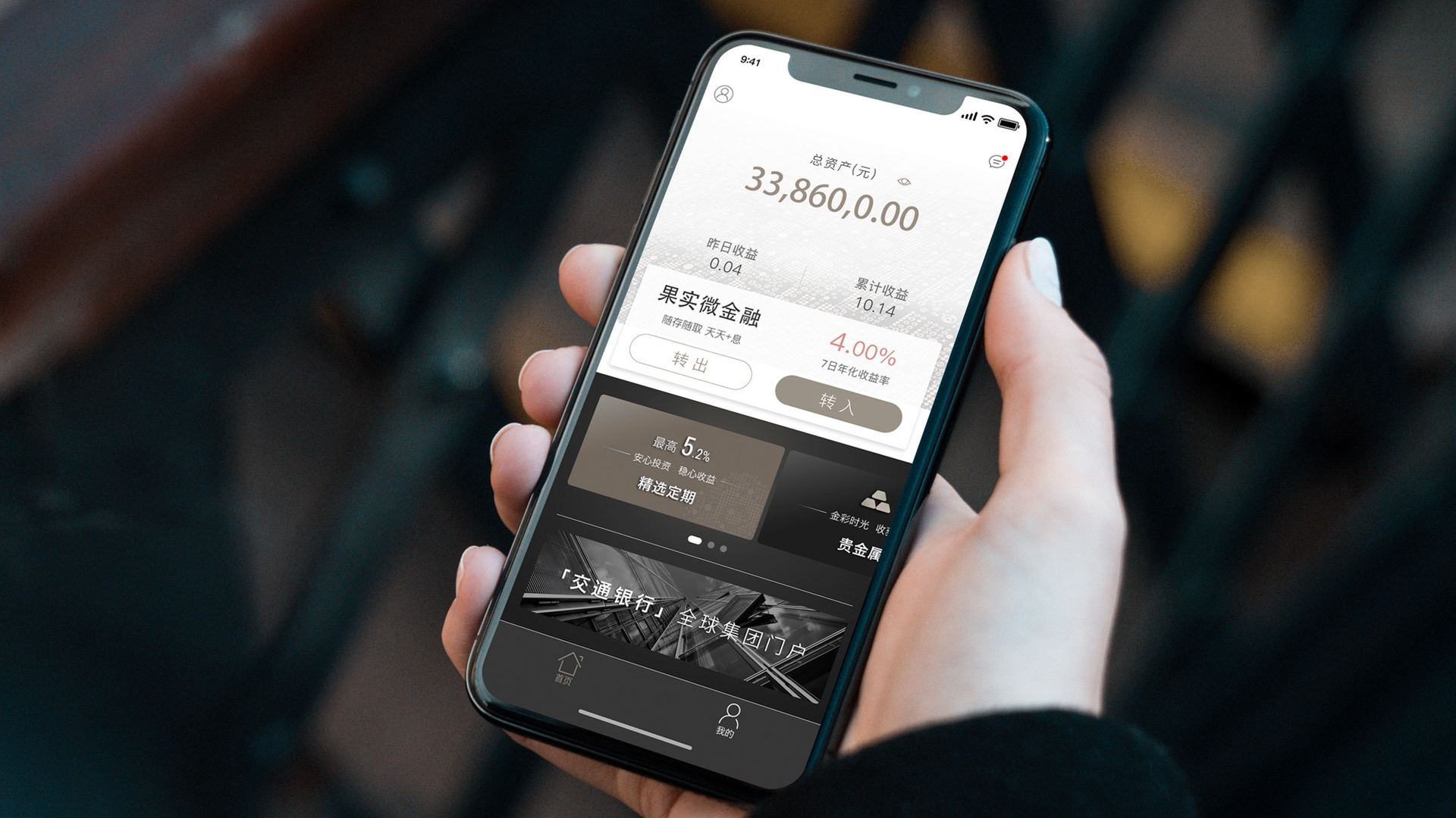
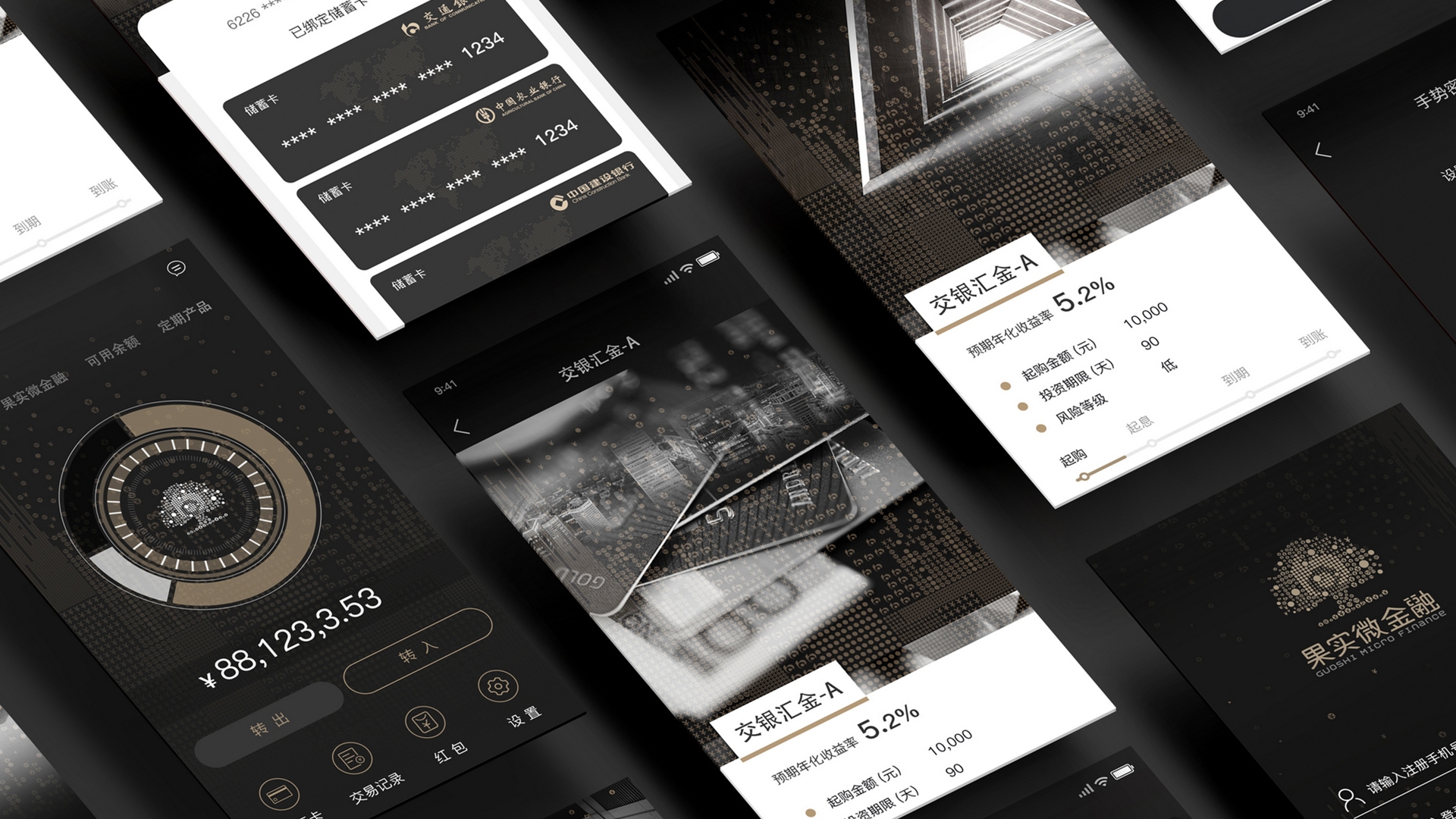
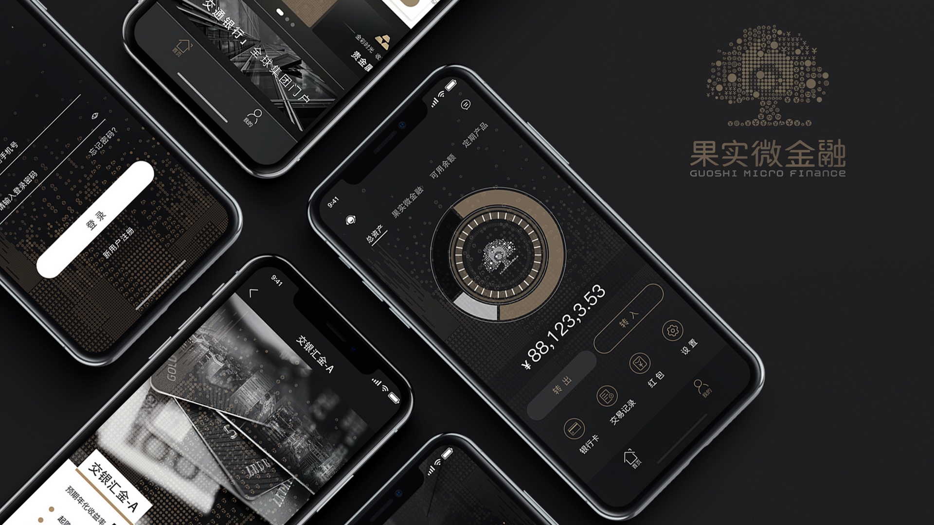
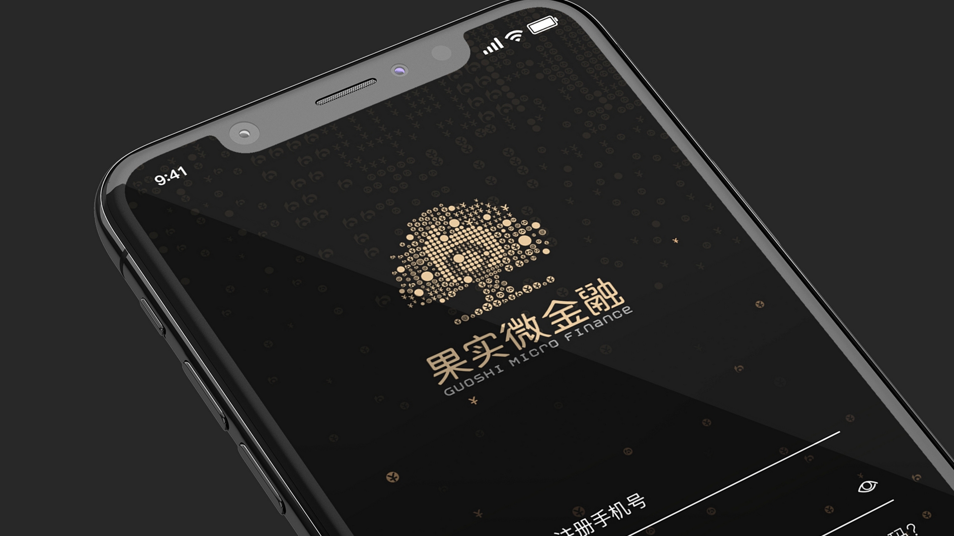
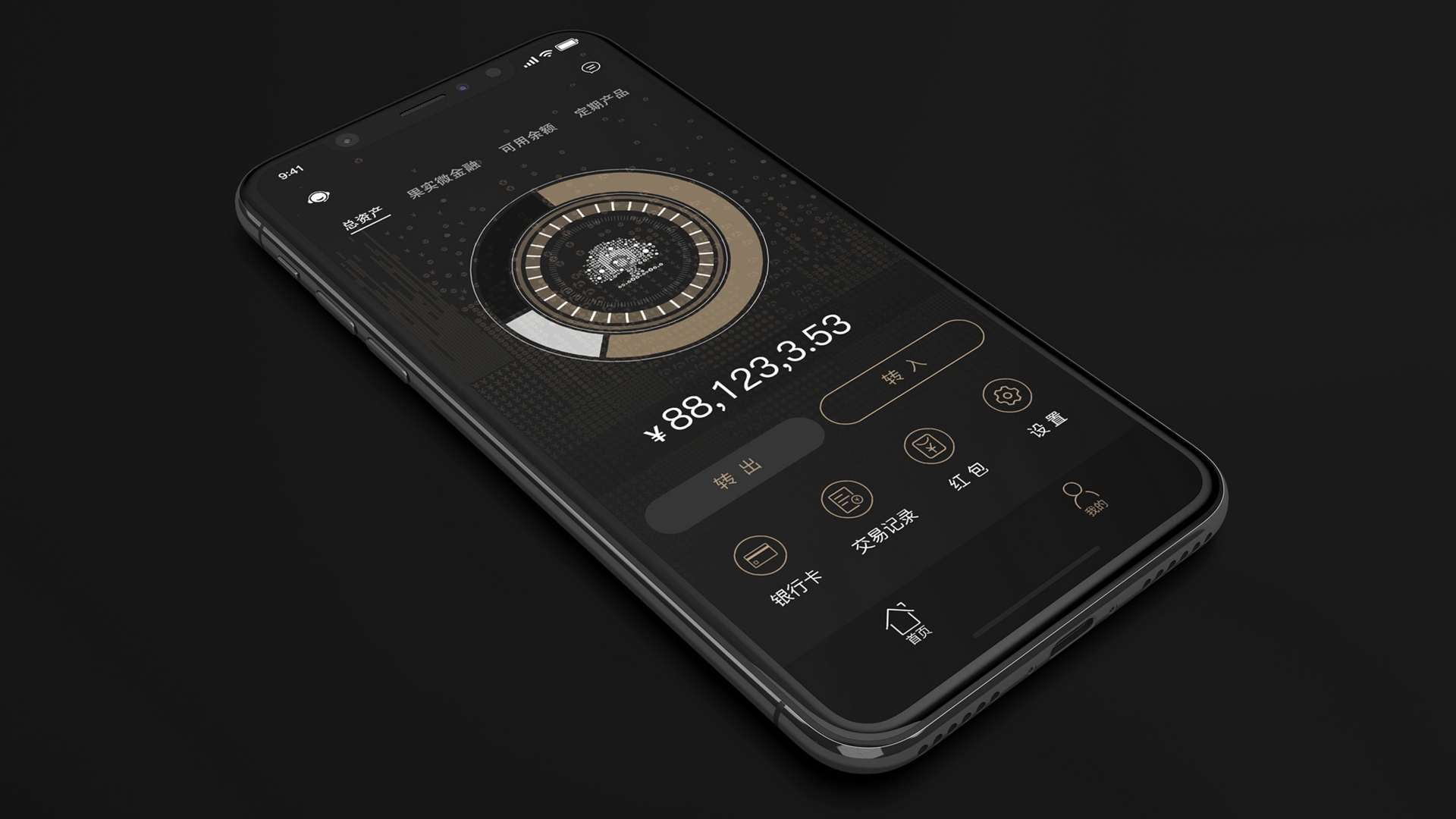
GUOSHI?Chinese Pinyin of the Fruit? Micro finance is a high-end financial app of Communication Bank of China?We designed the logo of GUOSHI (Fruit) and subtly blended the logo of the Communication Bank of China (the shape of B in the fruit tree) in the icon of the fruit tree. Then use the shape of the technology particles to combine the financial symbols. The combination of black and gold shows the luxury feeling of this interface design, reflecting the concept of high-end financial management.
Bio Hao SHAN is a Creative Director&Founder of Creplus Design-Shanghai.Graduated from National Higher College of Fine Arts in Limoges,France. Once served as Art Director of Publicis(Paris) and Visual Design Director of Technicolor Group’s headquarter(Paris).And he is also a visual design project evaluation expert of the Shanghai Municipal Government,a jury member at A`design award & Muse Creative Awards.Rich experience in international brand design projects,such as L`Oreal,Nike,SFR,Dassault,Thomson,Renault,Citroen,Nestlé,Disney,etc.


Recent Comments