
8 lnns Plus Hotel Brand Visual ldentity Design
PrizeOfficial Selection in Illustrate (graphic)
CompanyShanghai Sinostar Art Design Co, Ltd.
ArtistZhou Yu
CategoryProfessional
ClientDongguan Bafang Express Hotel Co., Ltd.
Credit8 lnns Plus Hotel Brand Visual ldentity Design
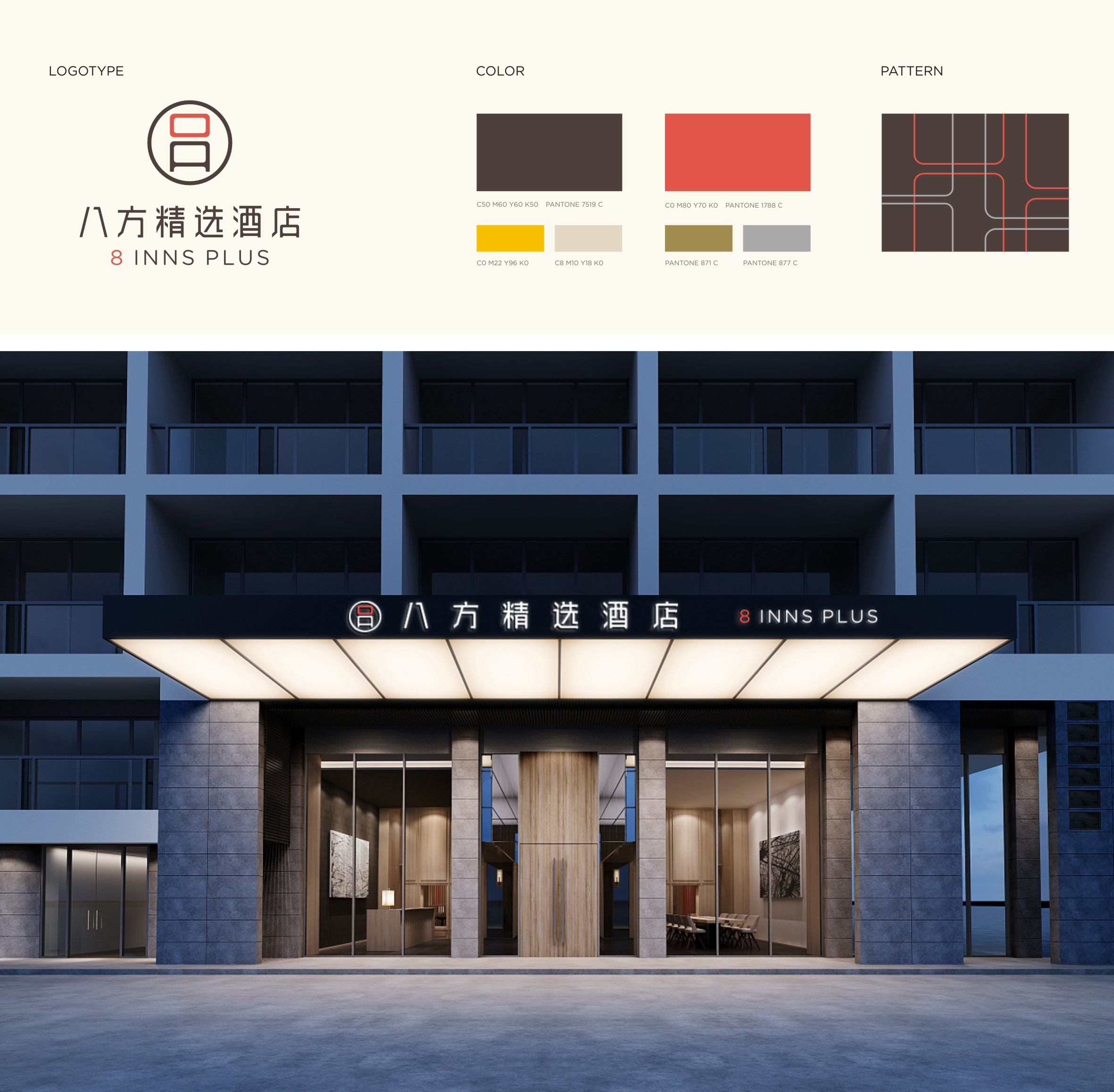
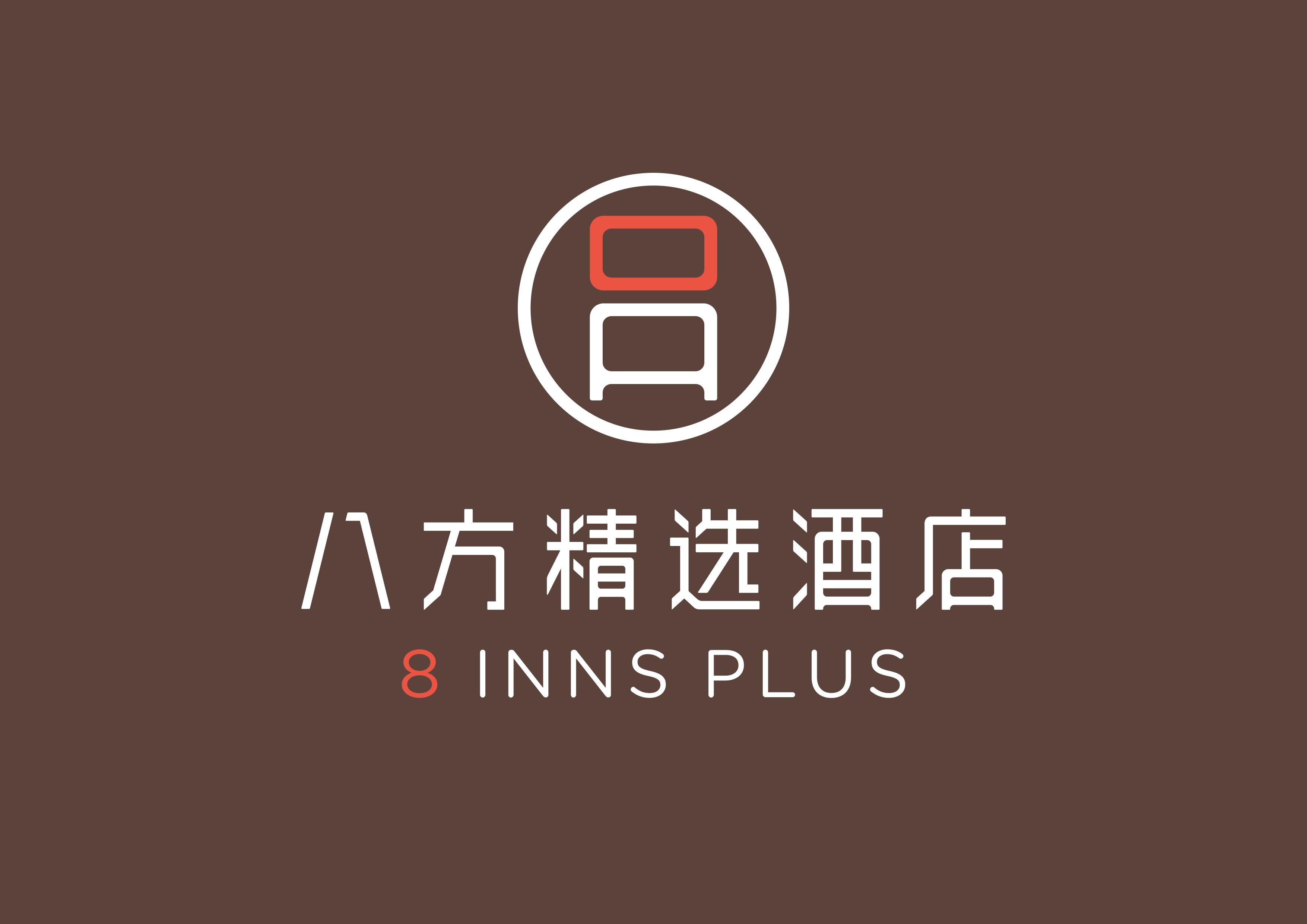
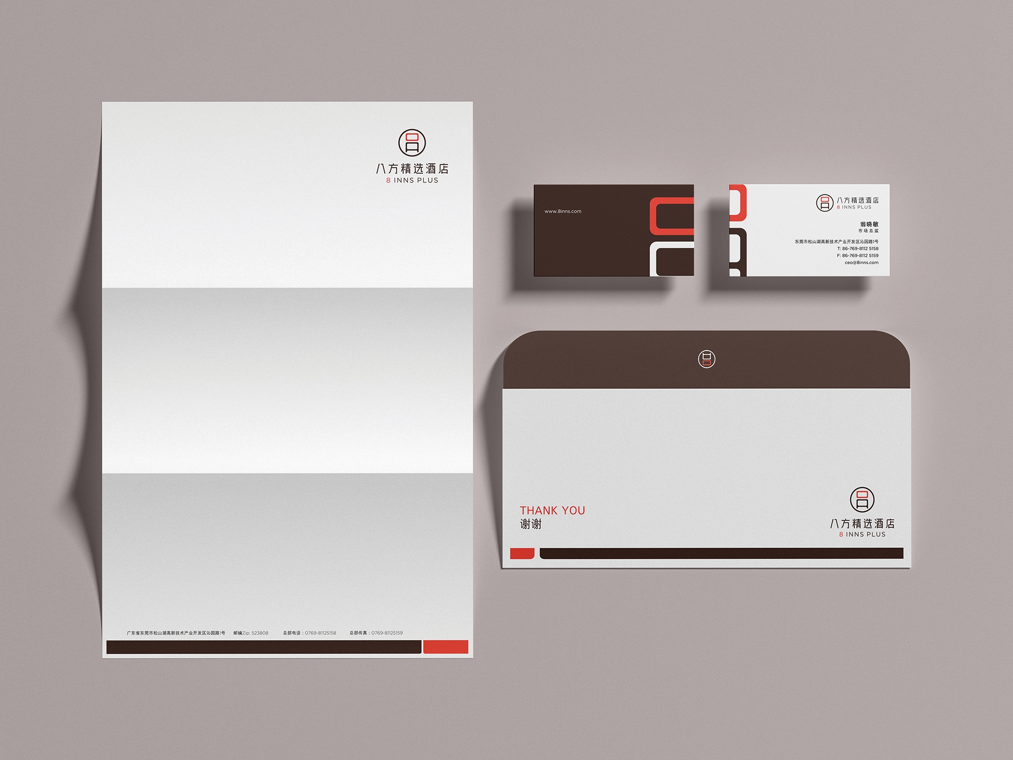
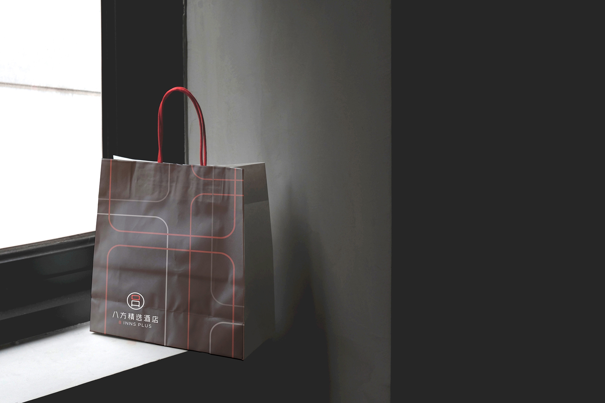
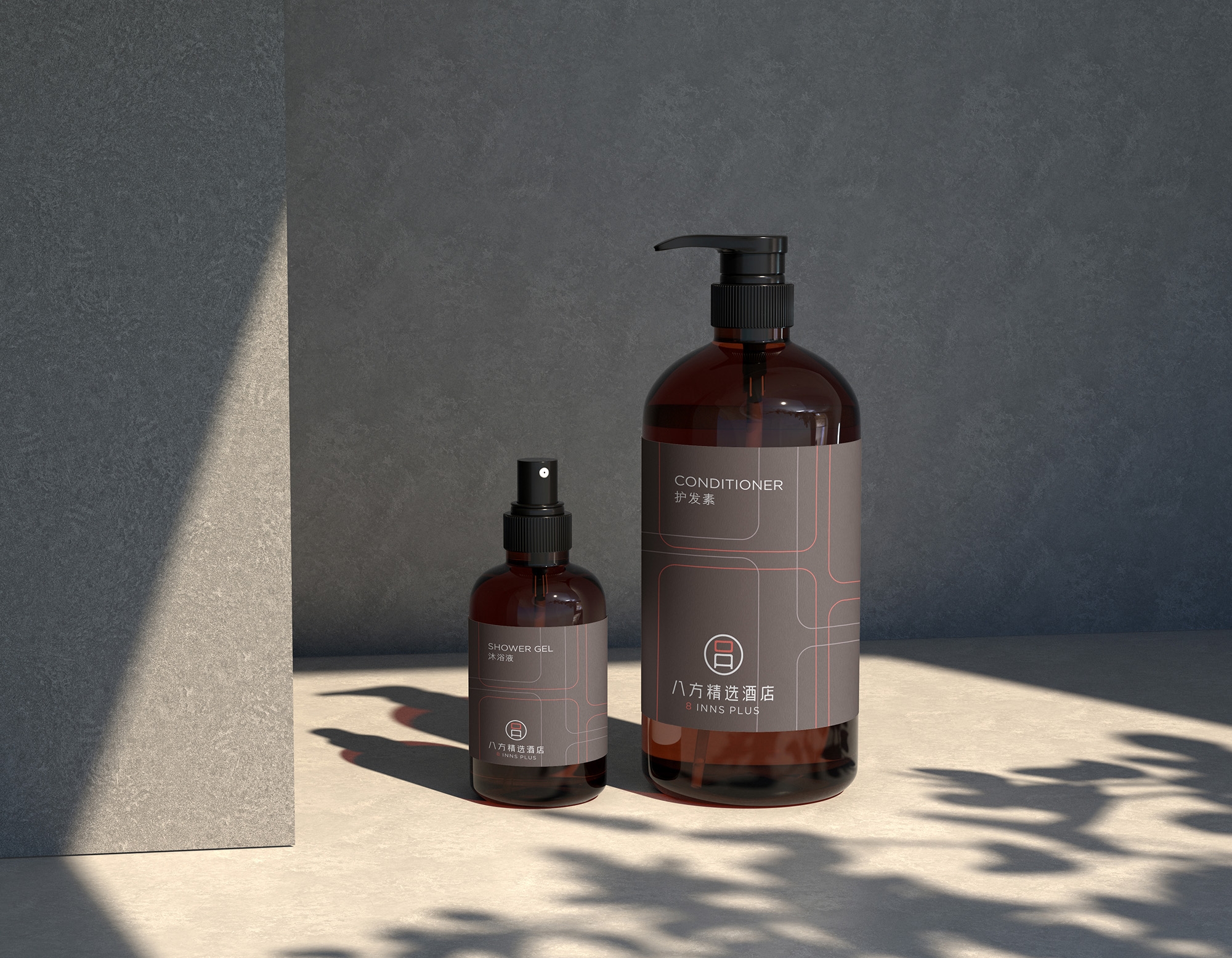
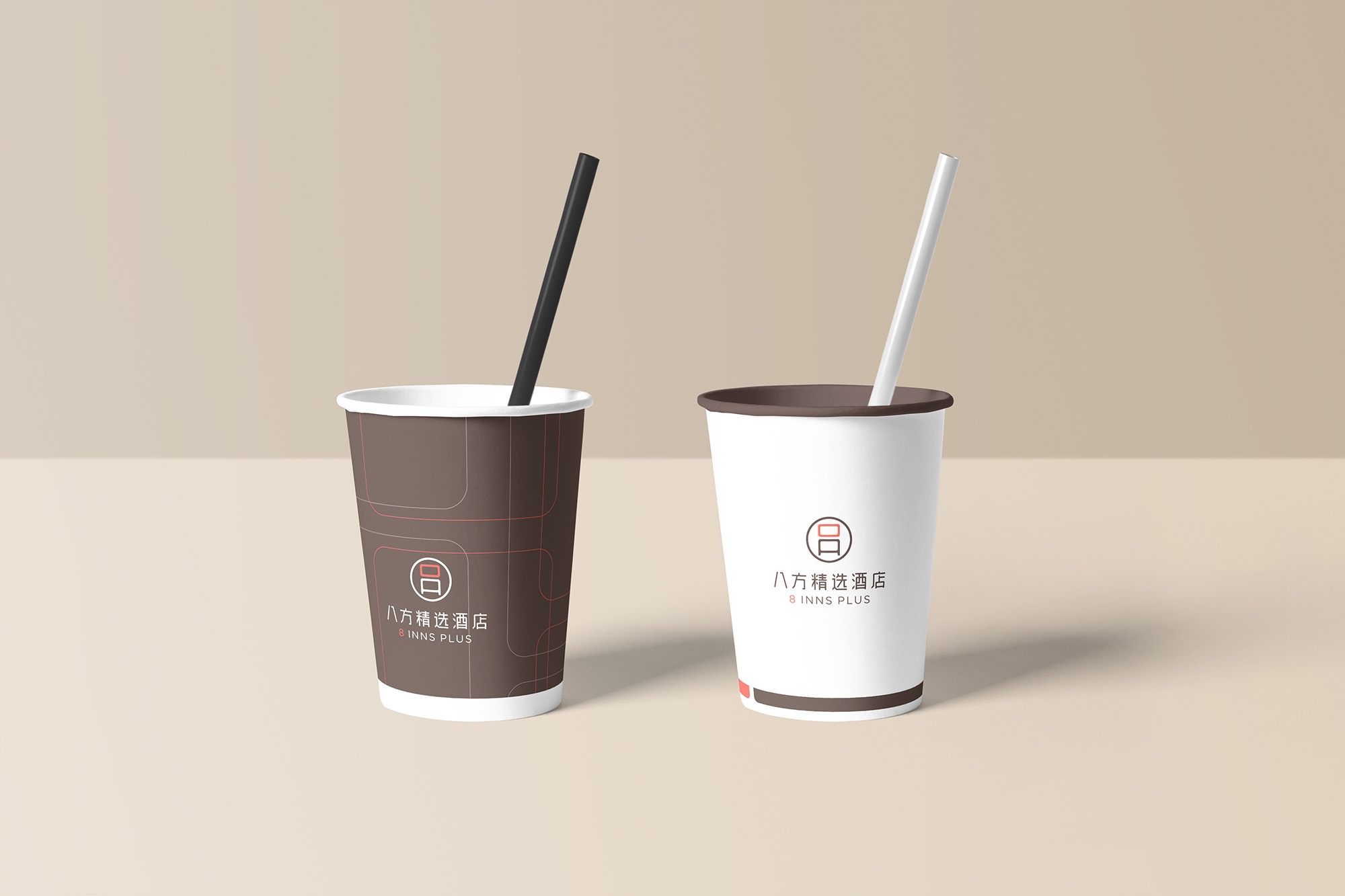
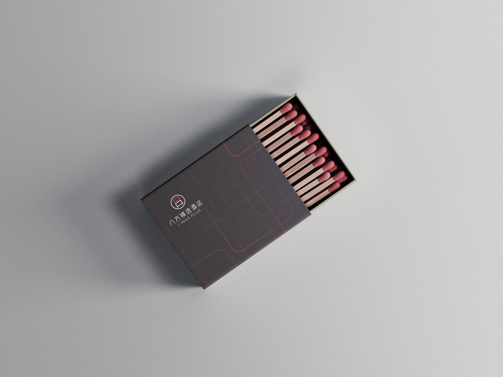
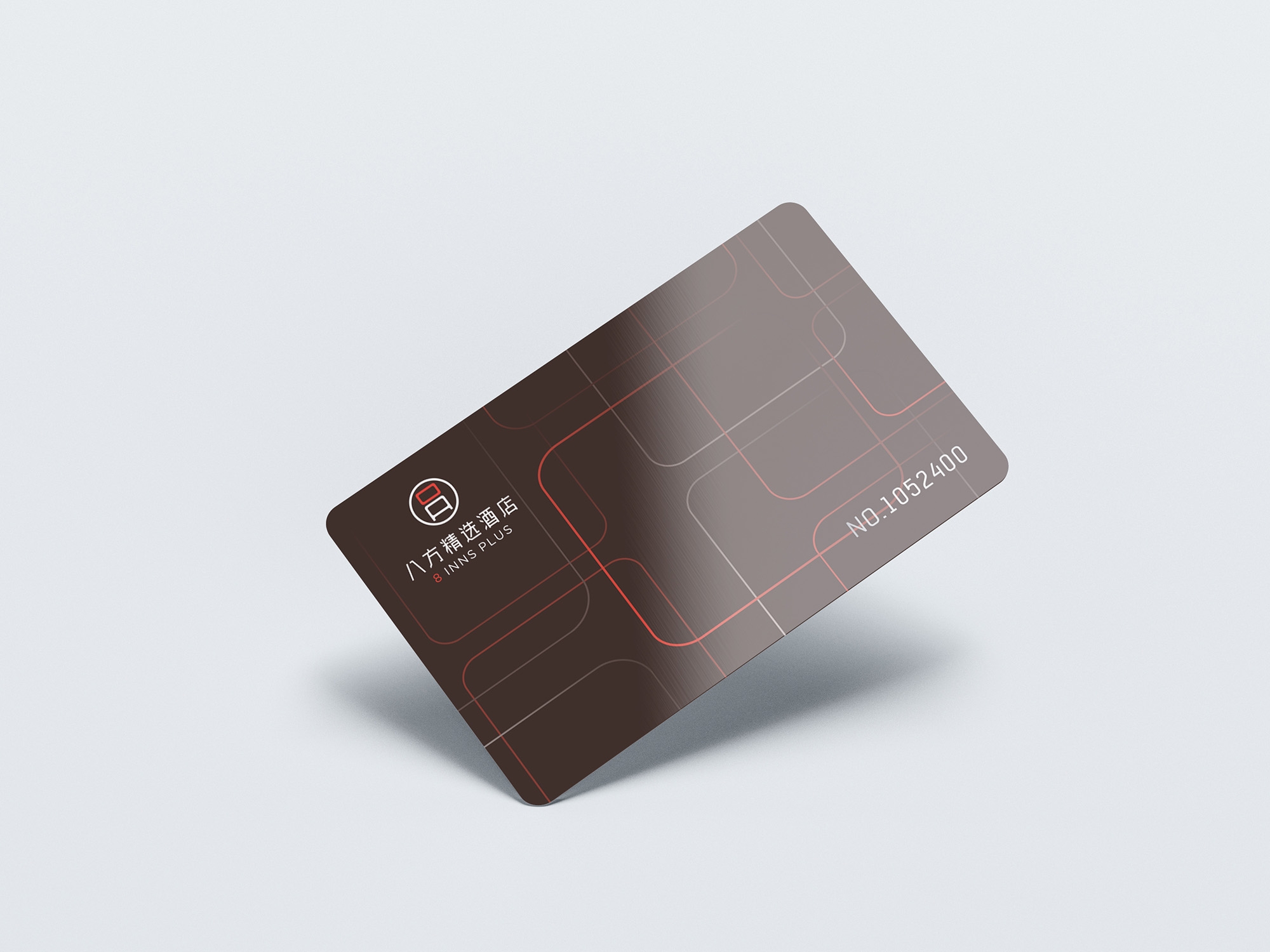
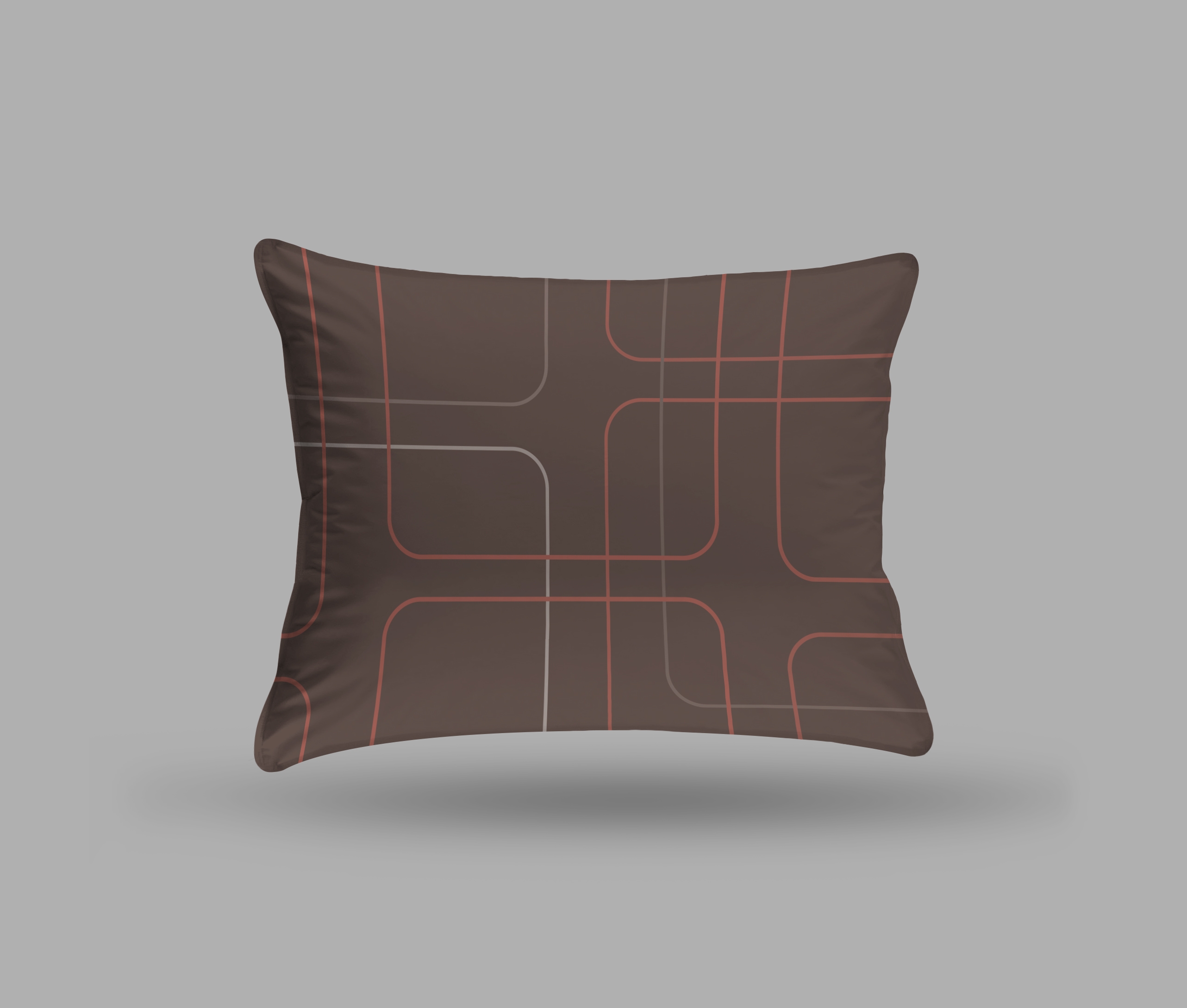
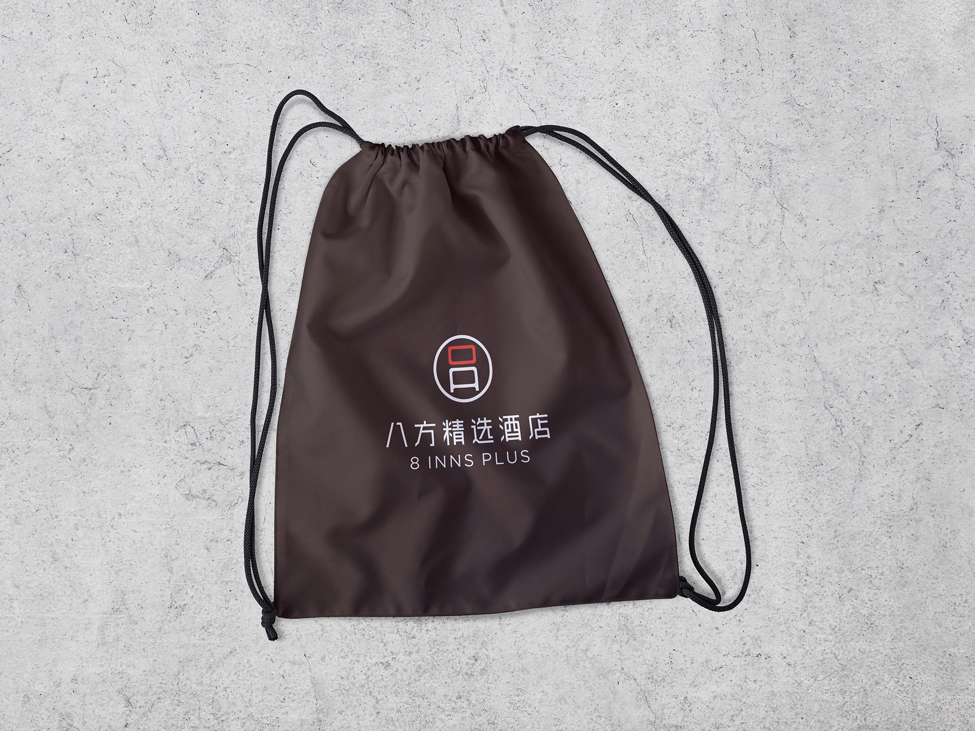
The logo is evolved from the number“8", which also resembles a window. The window signifies the opening and starting of a new space, and at the same time implies the meaning of tolerance and absorption, The logo is coloured in orange and dark brown, with orange representing energy and passion, symbolising 8 Inns Plus Hotels' brand values of genuine service and unique guest experiences. The colour sepia represents confidence and wisdom, symbolising 8 Inns Plus Hotels' brand values of going beyond quality and innovation.
Recent Comments