Shenzhen Expressway - Making Cities' Better Lives
PrizeShortlist in Illustrate (graphic)
CompanyShenzhen Polytechnic University
ArtistTaotao Xiong
CategoryProfessional
Design TeamTaotao Xiong, Haiyan Song, Biyuan Mao, Xiaotong Lin, Jiahong Peng, Yixin Lin, Yanjun Huang, Wanrong Zhu, Yuesheng Liao, Xiaoping Zhou, Xinyi Liu
ClientShenzhen Expressway Corporation Limited
Video URLView
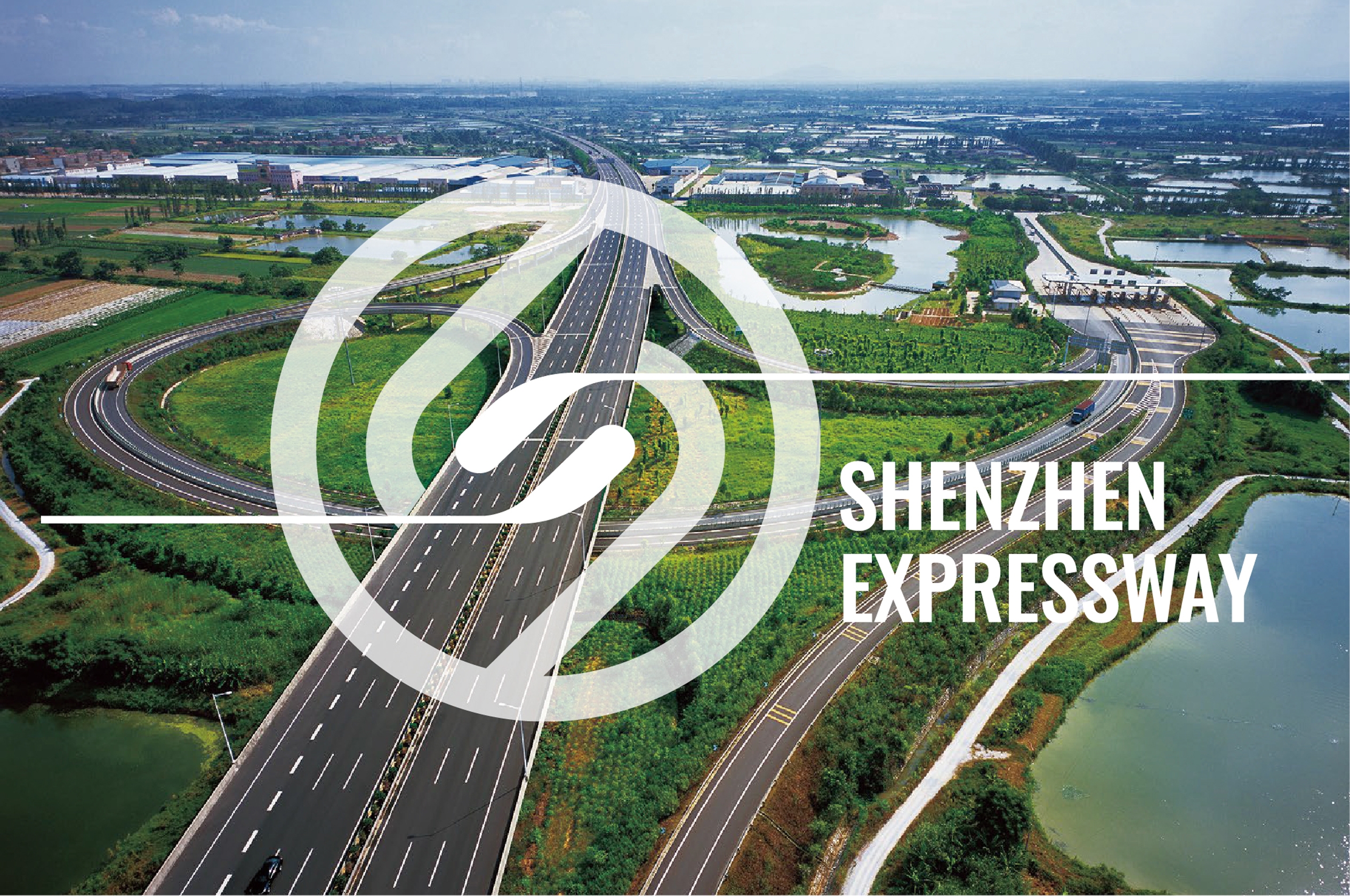
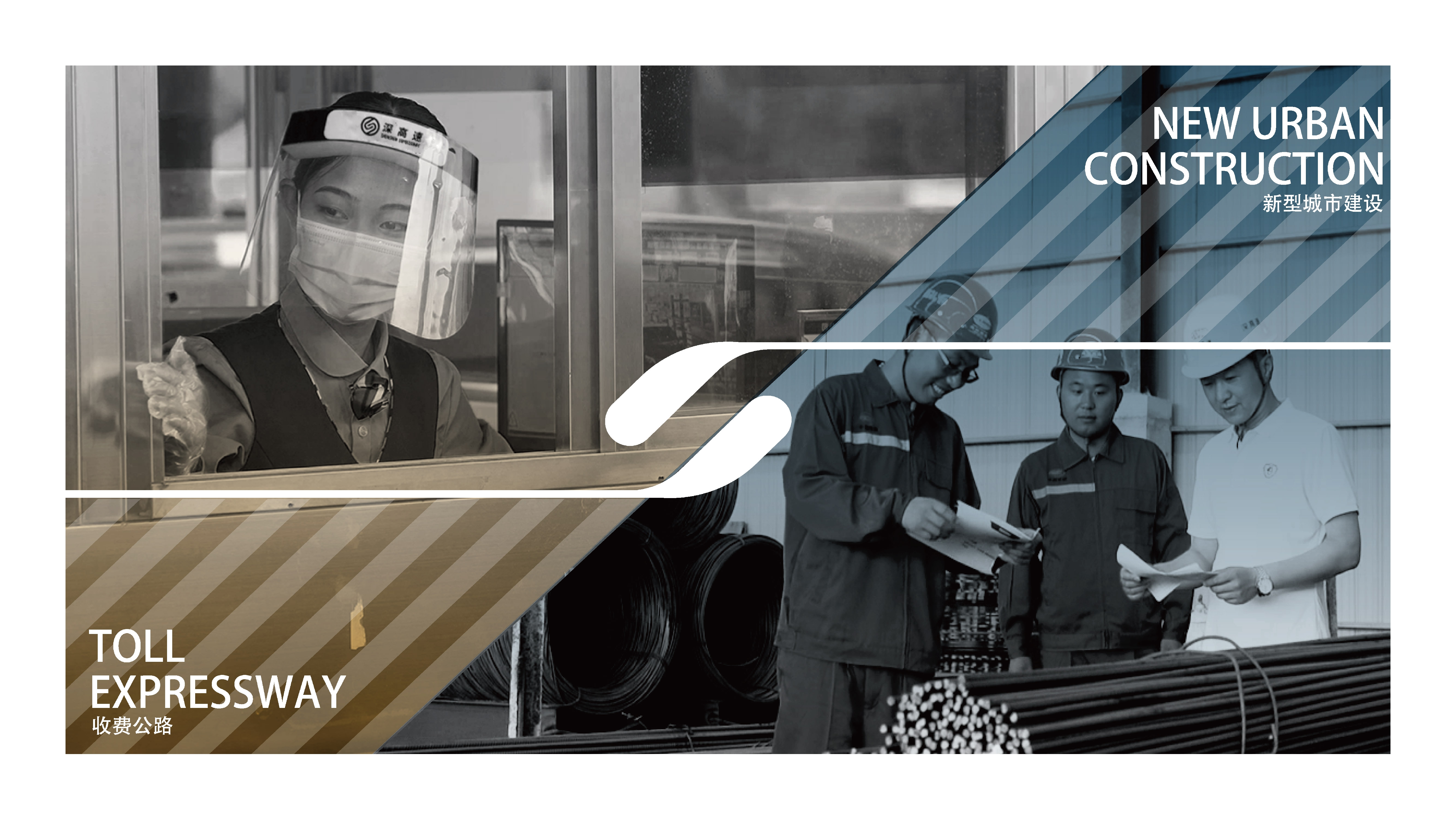
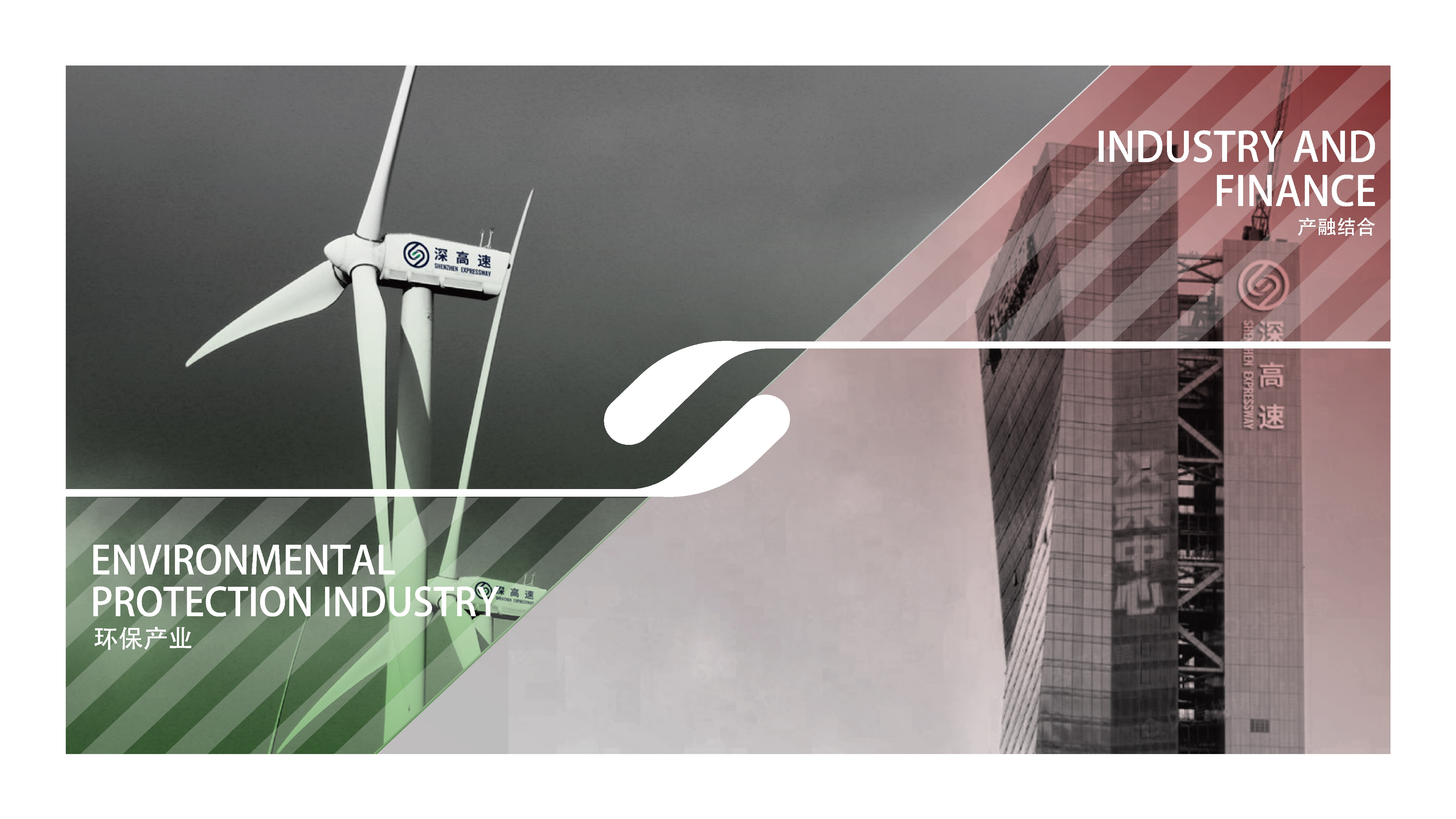
This work designed for Shenzhen Expressway Group which focuses on investment, construction, and operation management of expressways as well as environmental protection.
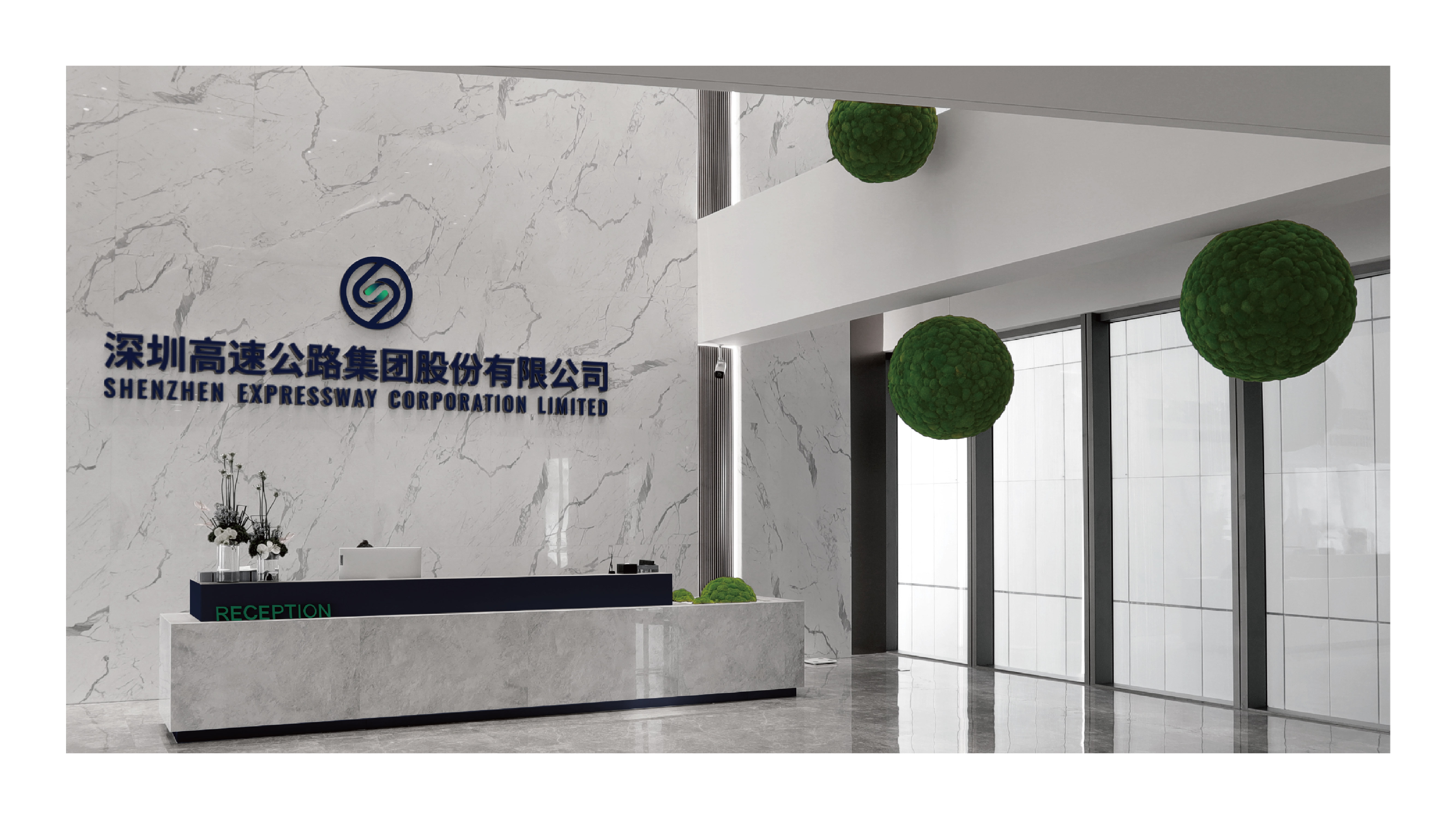
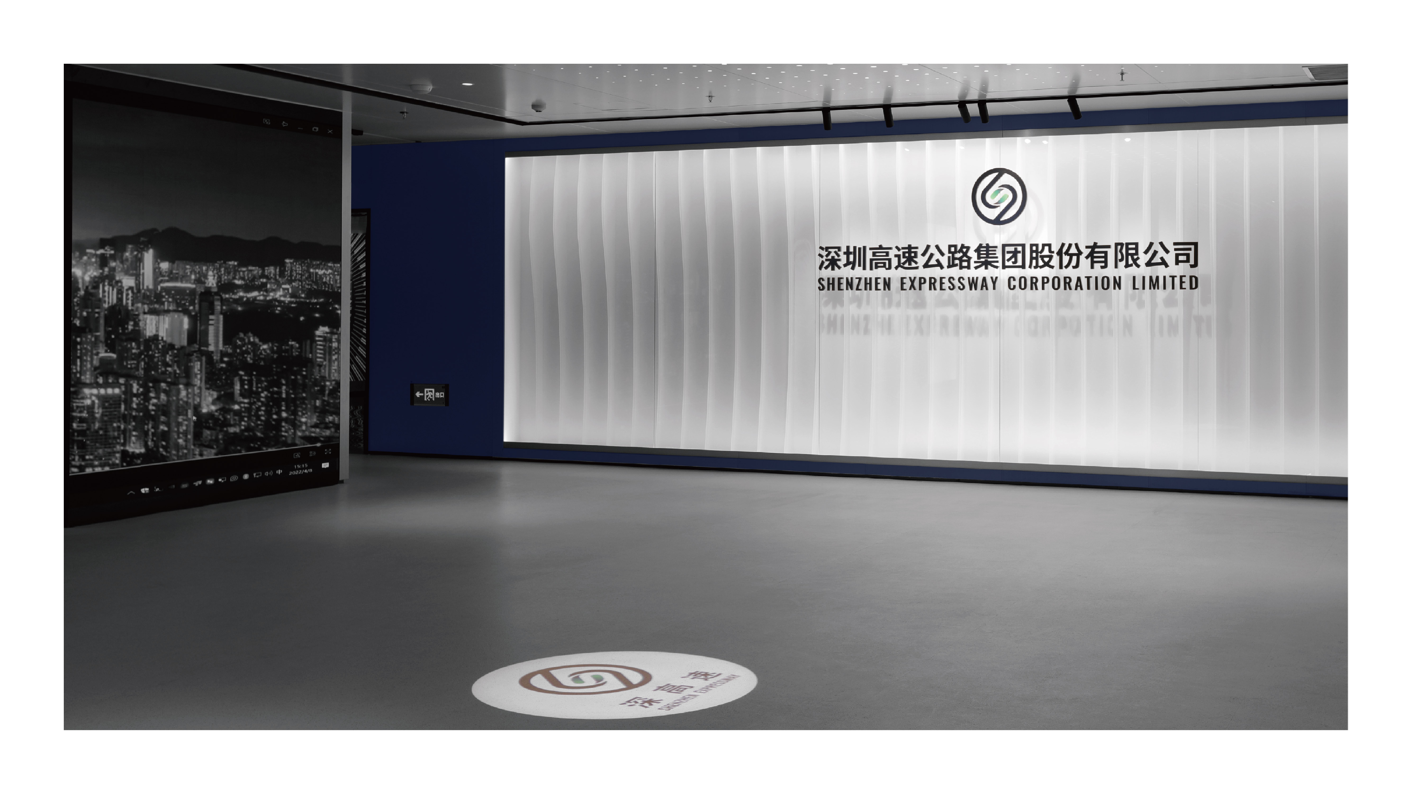
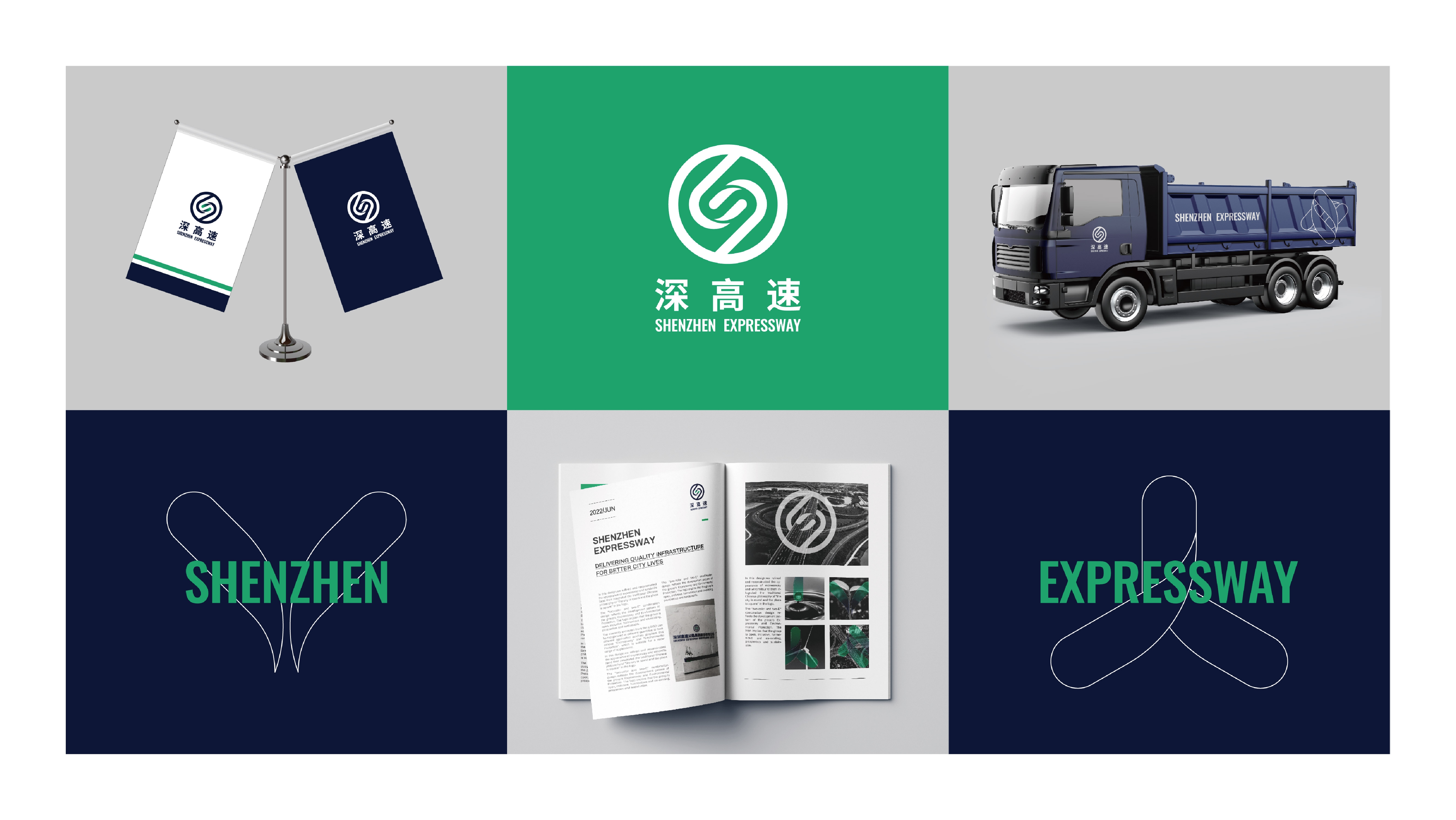
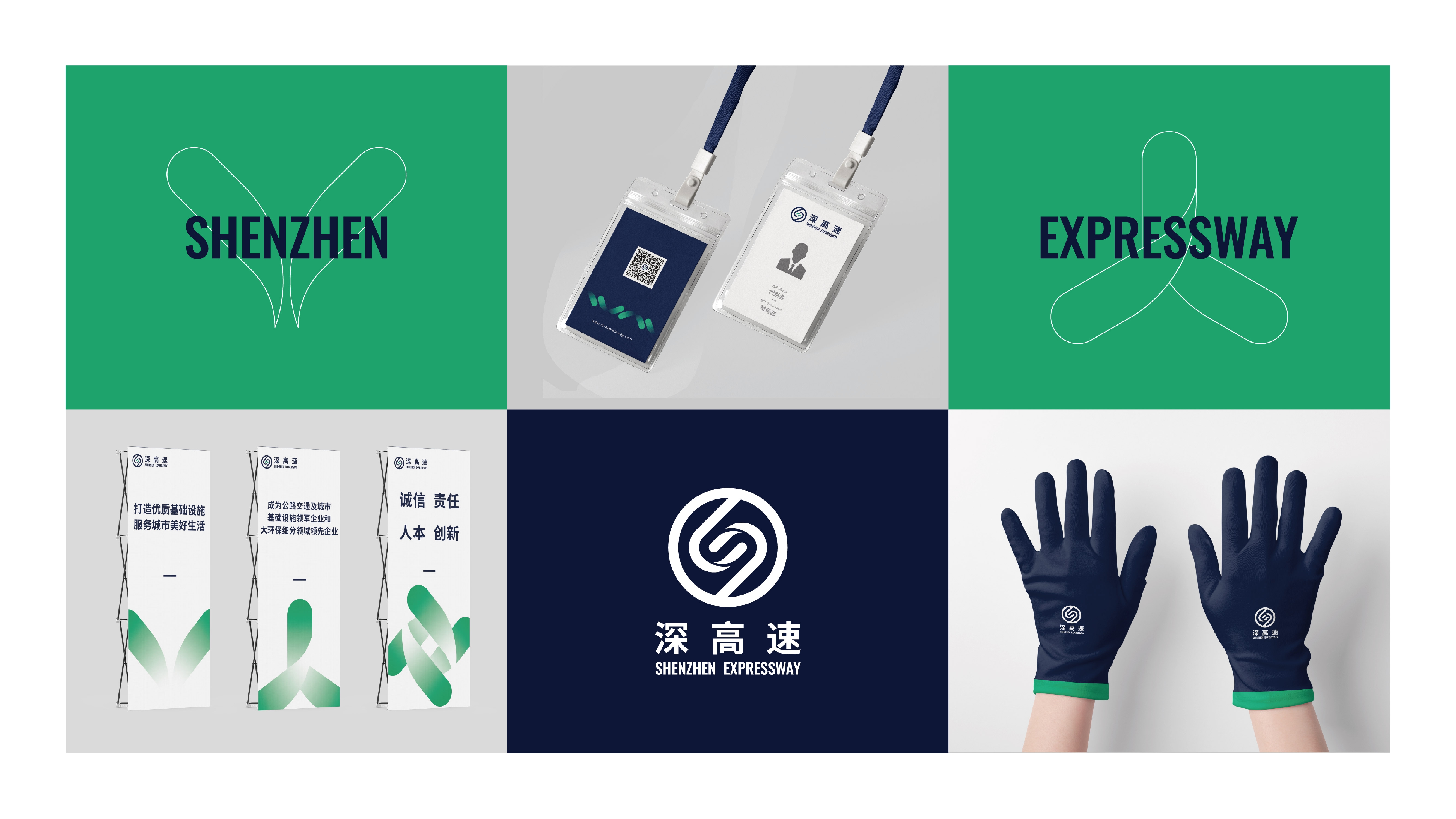
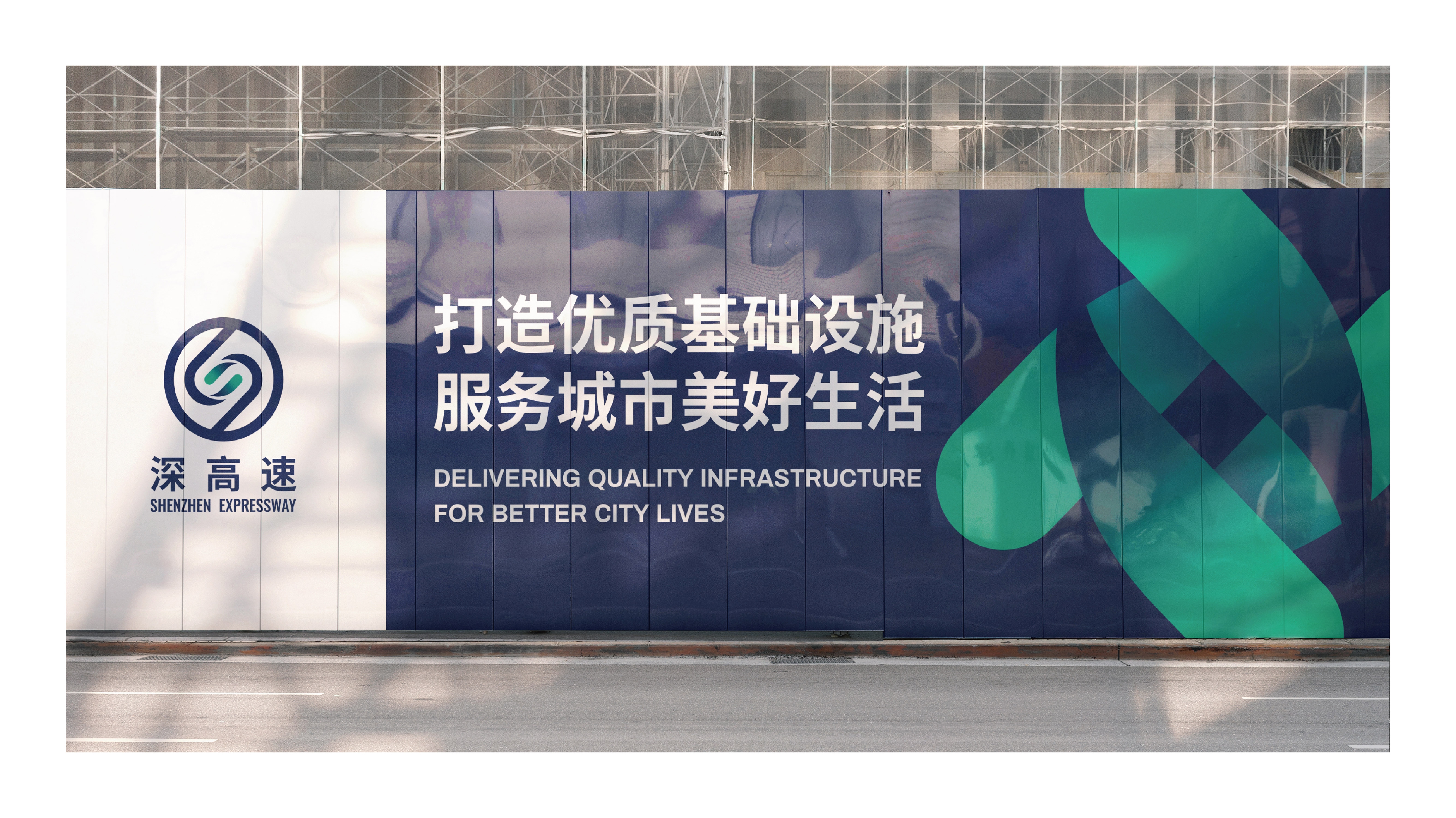
The overall shape of the brand's logo is round derived from steering wheel. The inner ring uses two conformal letters E forming a negative S, to represent the brand's initials. The two green leaves in the center represent the group's main businesses.
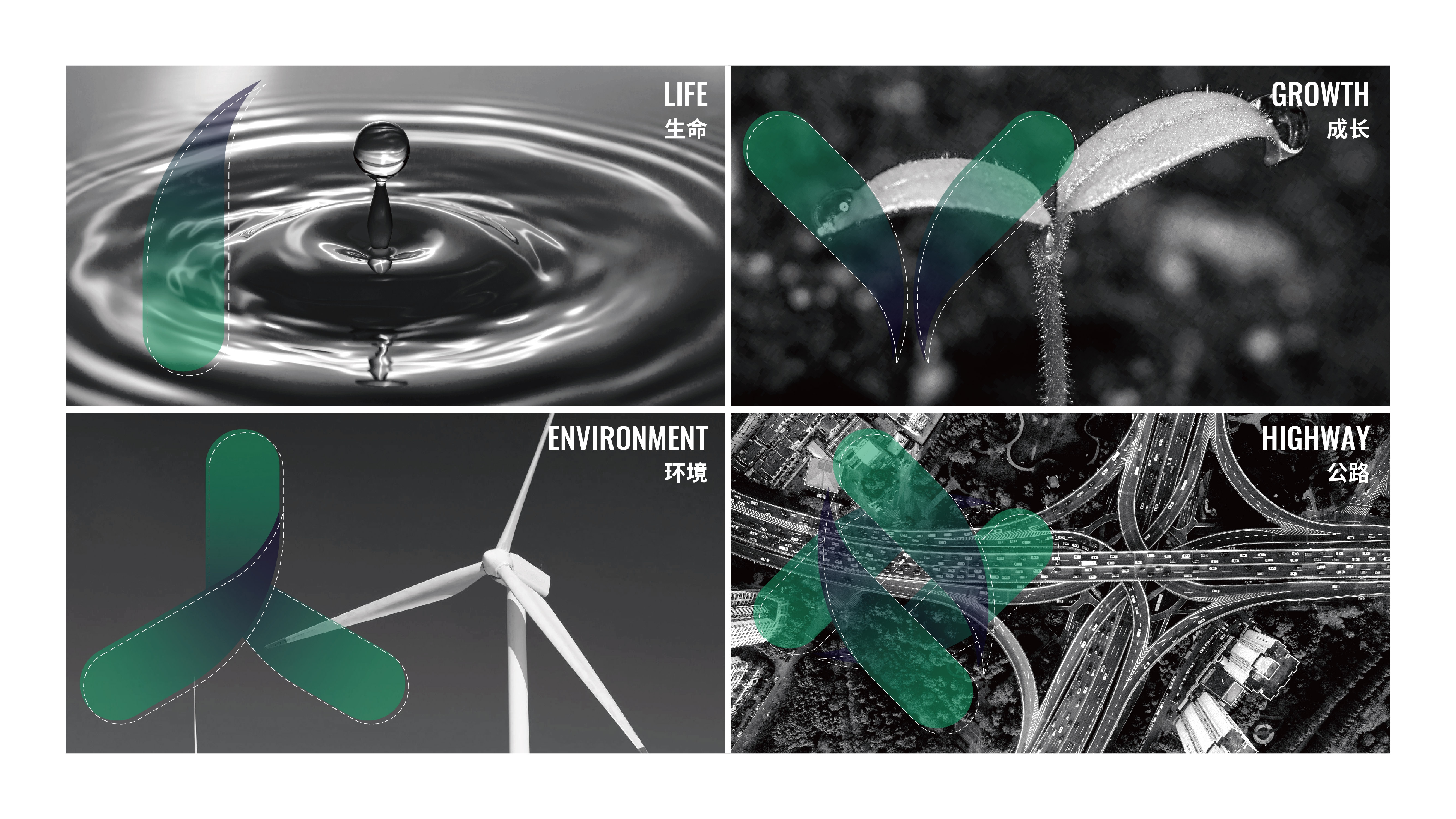
Auxiliary Graphics:
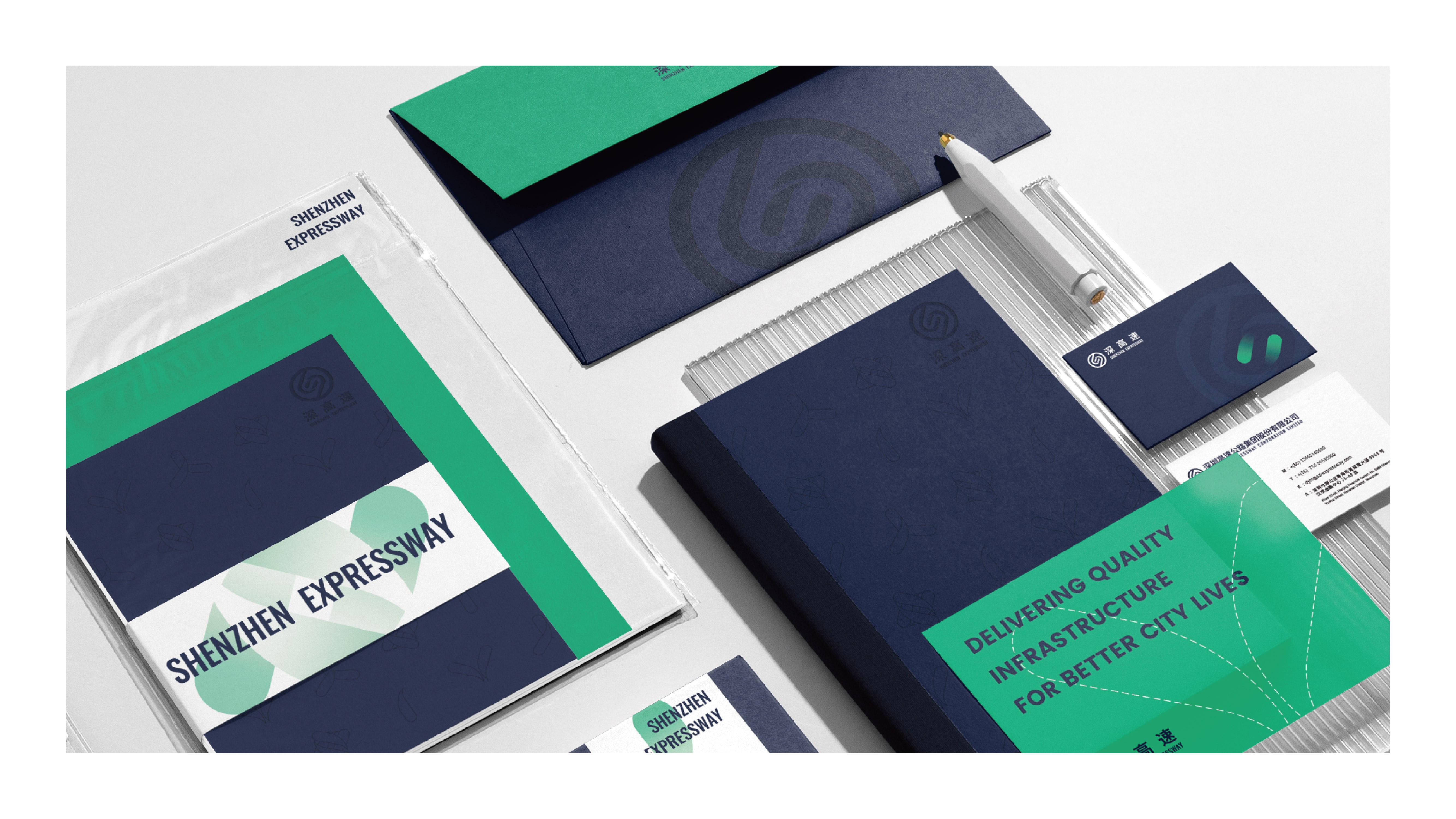
Containing one to four green leave(s), each one is interrelated, and conveys brand's philosophy — delivering quality infrastructure for better urban lives.


Recent Comments